Button
Buttons are the simplest and most common interactive element found on the web (other than links). With a single click, tap, or press, users can submit a form, perform a simple action, or even execute a complex set of chained actions … all from a rectangular object with some text and/or an icon inside.
Anatomy #
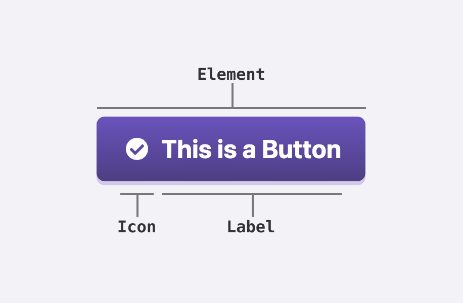
Element #
Button components should either be <a>, <button>, or the button <input> types, depending on the use case. Buttons for the user to navigate to another page should use <a>. Buttons for manipulating forms should be <input> (with the relevant type attributes for their purpose) And any button that performs other actions should be a <button>. When using <a> for buttons, make sure to add class="button" along with any other classes for style or size as needed (covered below). And when using <input> for elements, use the relevant types for the use case:
type="submit"for buttons to submit a form,type="reset"to reset a form,- and
type="button"for everything else.
Label #
Button labels should describe the action the user will perform when the button is clicked or pressed. Labels should be concise and clear. If using more than one word, the label should be title case.
Icon #
When using icons within a button, choose icons that clearly match the action in the label. Within a grouped set of buttons, icons should appear in all buttons or none of them. Do not mix some buttons with icons and some without.
Variations #
Buttons can vary by style and size. They may contain just text, an icon along with text, or a single icon. As interactive elements, they also have various states of interaction.
Styles #
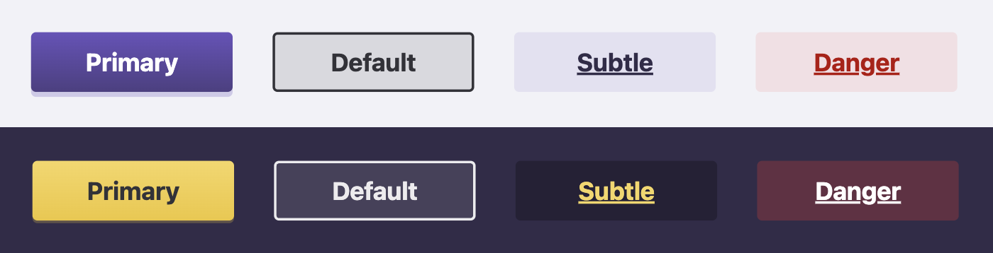
There are four button styles: Default, Primary, Subtle, and Danger.
Default #
The default button style has no background color and a simple, low-contrast border. It is designed to feel clickable and interactive without drawing too much attention. When in doubt, use this button. Hence the name.
<button>Default Button</button>
<a href="#" class="button">Default Button</a>
<input type="reset" value="Cancel" />
Primary #
Primary buttons have a filled background and no border. The fill may change depending on light or dark mode as well as background color. These should be the main call to action within a given page or section, and they are designed to draw attention. They should only appear once in a given space, but not every page or section needs a primary button.
<button class="primary">Primary Button</button>
<a href="#" class="button primary">Primary Button</a>
<input type="submit" value="Submit" class="primary" />
Subtle #
Subtle buttons appear very similar to links, but they have a larger clickable area. Subtle buttons represent secondary or less important actions a user may perform or links they may follow. They are most likely to accompany a primary button as secondary actions (like close within a modal or clearing a form) or appear within large sets of data.
<button class="subtle">Subtle Button</button>
<a href="#" class="button subtle">Subtle Button</a>
<input type="button" value="Subtle Input" class="subtle" />
Danger #
Danger buttons are similar to subtle buttons but in red. They denote destructive, irreversible actions that should only be performed with extreme caution. Do NOT use danger buttons for non-destructive actions.
<button class="danger">Danger Button</button>
<a href="#" class="button danger">Danger Button</a>
<input type="button" value="Danger Input" class="danger" />
Sizes #
There are three button sizes: small, medium, and large. Medium is the default size and should be used in most cases. Large buttons are best used in empty states, to initiate important flows, or as the most important call to action in a larger block. Use small buttons in tight spaces or for less important actions.
You can define button sizes by adding either large or small to the button class. Medium is the default so there’s no need to define it.
<button class="large primary">Large Primary Button</button>
<button>Medium Default Button</button>
<button class="small danger">Small Subtle Button</button>
<button class="small danger">Small Danger Button</button>
With or without icons #
Buttons can also optionally include icons. Use <a> or <button> elements when including icons since you can't place icons inside the value attribute of the <input> element. By default, added icons will appear on the left side of labels. You can add class="right" to the <svg> for icons to force them to appear on the right side of the label.
You can also create icon-only buttons by adding the icon-only class to the button element. You should still provide alternative text for accessibility.
<a class="button">
	<svg aria-hidden="true" focusable="false">
		<use href="/-/img/icons.svg#arrow-left"></use>
	</svg>
	Older
</a>
<a class="button icon-only">
	<svg aria-hidden="true" focusable="false">
		<use href="/-/img/icons.svg#home"></use>
	</svg>
	<span class="visually-hidden">Home</span>
</a>
<a class="button">
	<svg aria-hidden="true" focusable="false" class="right">
		<use href="/-/img/icons.svg#arrow-right"></use>
	</svg>
	Newer
</a>
States #
Hover / Focus #
On both hover and focus, all buttons will animate upward slightly. Depending on the button style, text color, background or border styles may change to give obvious affordance from the default state.
- Default: A transparent dark background (in light mode) or a transparent light background (in dark mode) appears, and the border lightens or darkens in hover to match the overall text color.
- Primary: The subtle background gradient will darken (light mode) or lighten (in dark mode) with a subtle drop shadow.
- Subtle: The background becomes slightly darker (color-tinted in light mode and neutral shade in dark) and the text increases in contrast (darker in light mode and lighter in dark mode).
- Danger: A transparent red background appears in both modes and the text increases in contrast (darker in light mode and lighter in dark mode).
Focus-Only #
On focus, all buttons should receive the universal :focus treatment, a slightly offset, high-contrast 2-pixel outline.
Disabled #
There may be occasional use cases to disable buttons, such as when information must be added before the button action can be performed. In such cases, buttons can be disabled by adding the disabled attribute. It is important to note that the disabled attribute only applies to form fields and buttons. It will not functionally disable an <a> link button, so it should only be used with <button> and <input> elements.
<input type="submit" value="Disabled Primary" class="primary" disabled />
<input type="button" value="Disabled Default" disabled />
<button class="subtle" disabled>Disabled Subtle</button>
<button class="danger" disabled>Disabled Danger</button>
Utilities #
Expanding buttons #
Finally, you can create buttons that fill the width of the space they appear in using the expand class. This should only be used within smaller containers such as cards or table cells. Do NOT expand buttons the full width of a page (unless using them in a smaller component that spans the full page width on mobile).
<button class="primary expand">Expanded Primary Button</button>